01 / Restaurant
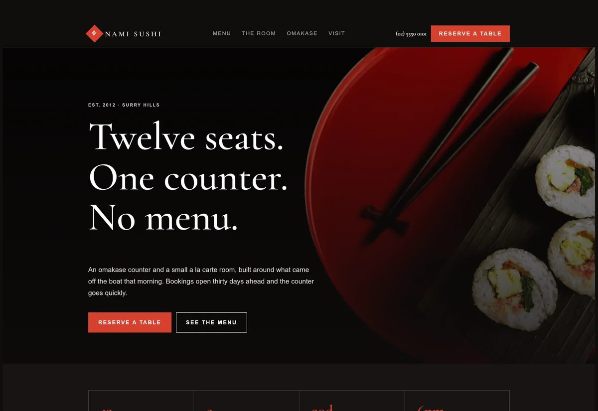
Restaurant & sushi bar
Dark lacquer, vermillion and a high-contrast serif. Built for menus, bookings and mood.
Cormorant GaramondView design →
Real pages, not portfolio screenshots. Open one, scroll it, resize it, read the copy. Then tell us which parts you want and which you do not.
Dark lacquer, vermillion and a high-contrast serif. Built for menus, bookings and mood.
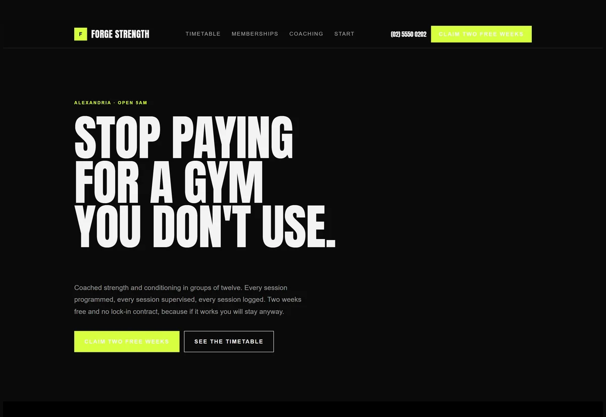
Black, acid lime and condensed caps. Timetable, memberships and a free-trial funnel.
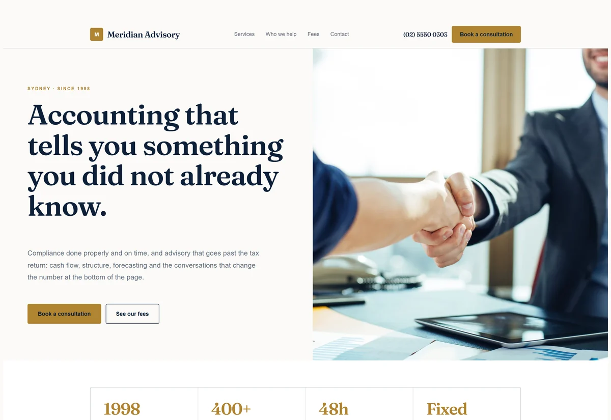
Navy, antique gold and a warm serif. Services, fee transparency and a booking CTA.
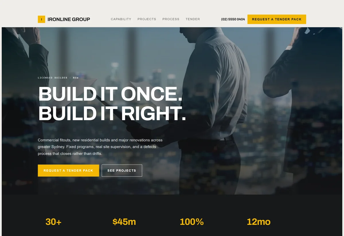
Concrete grey, hazard yellow and heavy grotesk caps. Projects, capability, tender-ready.
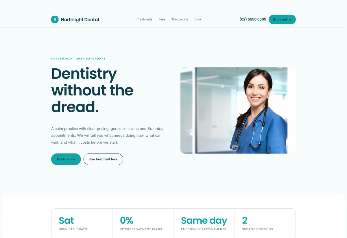
Soft white, clinical teal and generous rounding. Treatments, pricing and online booking.
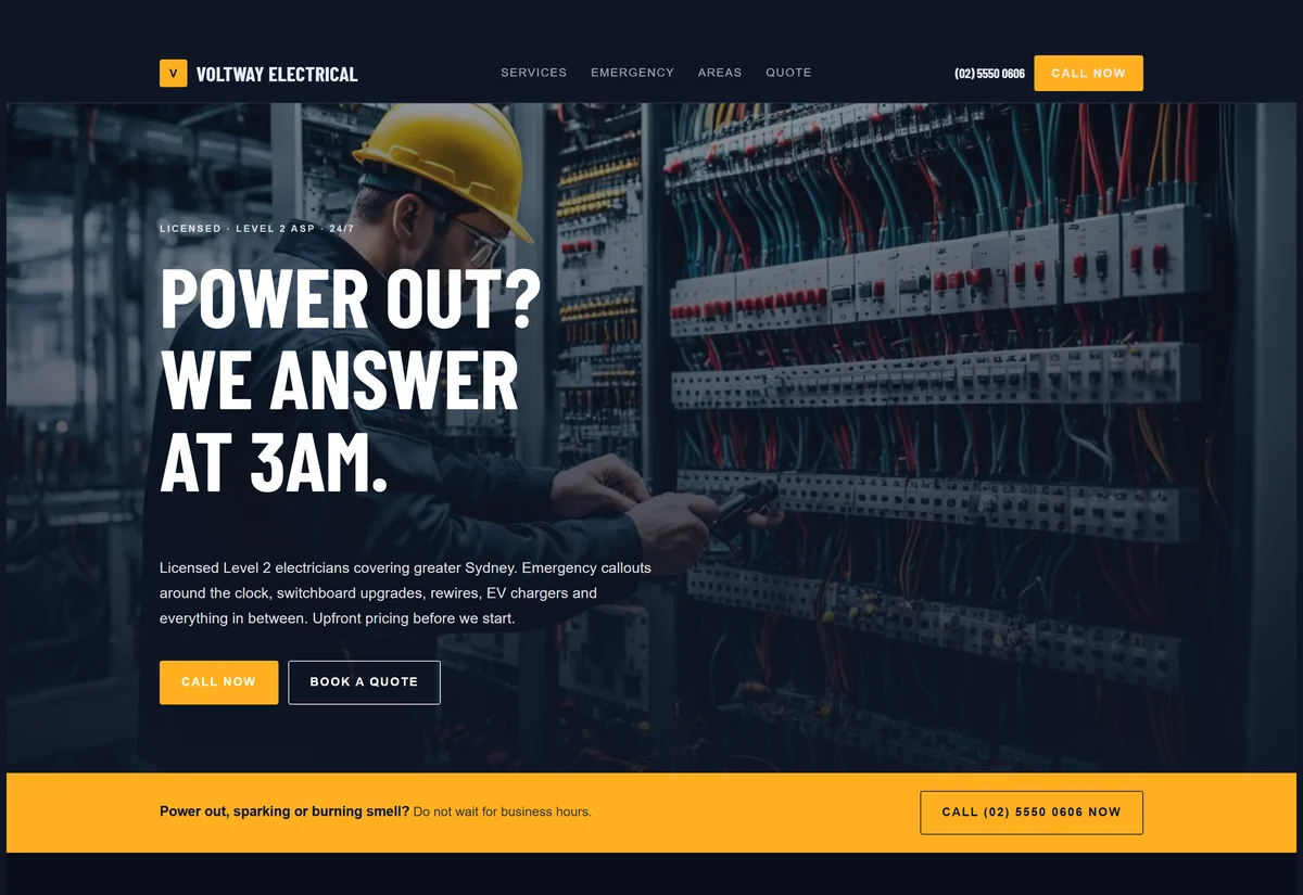
Midnight blue, live amber and condensed type. Emergency bar, service grid, service areas.
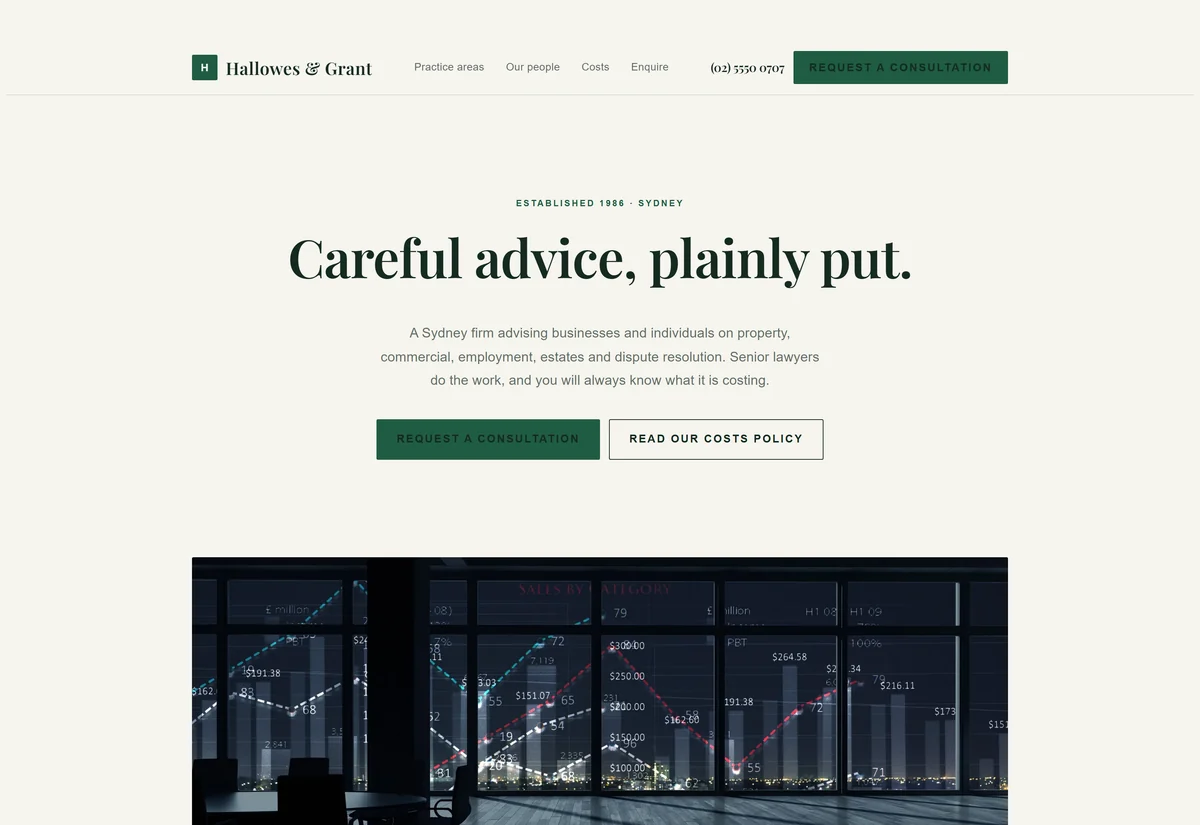
Ivory, deep green and Playfair. Practice areas, people, and a discreet enquiry path.
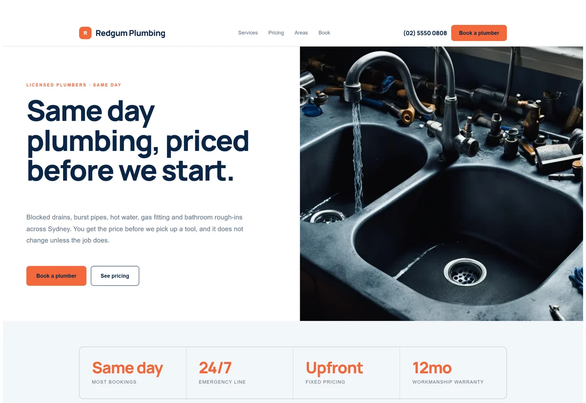
White, deep navy and hot orange with soft radii. Upfront pricing and a same-day promise.
Every one of these is a genuine design decision made for that industry: the palette, the typeface, the amount of white space, how loud the call to action is. None of them is a theme you buy and share with four hundred other businesses.
A cafe is close to the restaurant design. A physio is close to the dental one. A landscaper, roofer, painter or tiler is close to the plumbing and electrical designs. A consultancy is close to the accounting one. Tell us your industry and we will point you at the nearest starting point, or design something new.